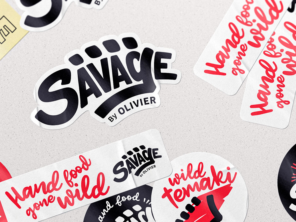
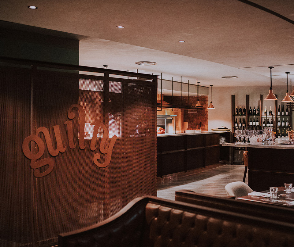
Guilty is a well known restaurant in Lisbon, and the perfect night out starter for many. Due to its high-class cuisine in a relaxed format, night bar atmosphere, and its famous Guilty Parties. And with the expansion to 2 new locations and a whole new menu on its way, there was a need for fresh new positioning and a sharp visual system to ensure the shared identity of the 3 locations.
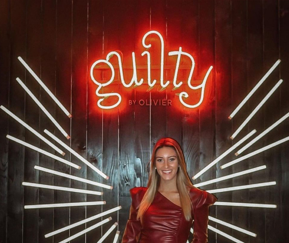
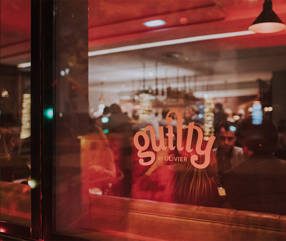
The logo was reworked into a more refined typographical structure. Refraining a bit from its classical high contrast serif style, but maintaining the ligatures and curved structure that gave it its iconic crown/tiara shape. And the new positioning was summed up in the brand’s tagline as “Less guilt. More #foodporn.” due to its irreverent and ultra photogenic menu. While the visual system was built on top of a rebellious vandalism theme, toned down to a luxurious upper class format.
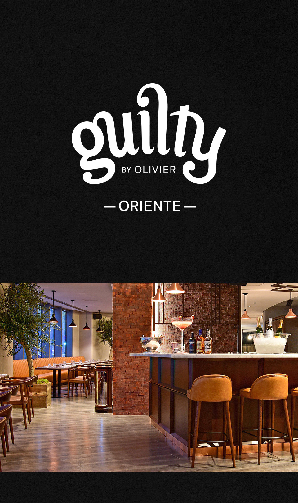

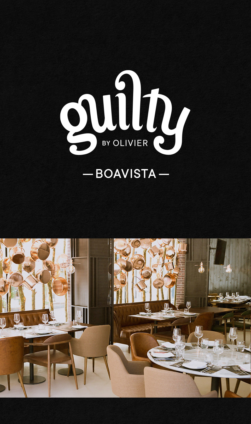
A new visual communication system, under the new brand positioning "Less guilt. More #foodporn."
CLIENT: GUILTY BY OLIVIER | PROJECT: BRAND UPDATE | AGENCY: TORKE CC
BRAND DESIGN: DANIEL MACHADO | DESIGN: ALEXANDRE TIAGO E CATARINA CAPELO
COPYWRITTING: MARIANA MARTINS | HEAD OF DESIGN: RUI CONCEIÇÃO SANTOS
BRAND STRATEGY: SARA ANDRADE
BRAND DESIGN: DANIEL MACHADO | DESIGN: ALEXANDRE TIAGO E CATARINA CAPELO
COPYWRITTING: MARIANA MARTINS | HEAD OF DESIGN: RUI CONCEIÇÃO SANTOS
BRAND STRATEGY: SARA ANDRADE
