

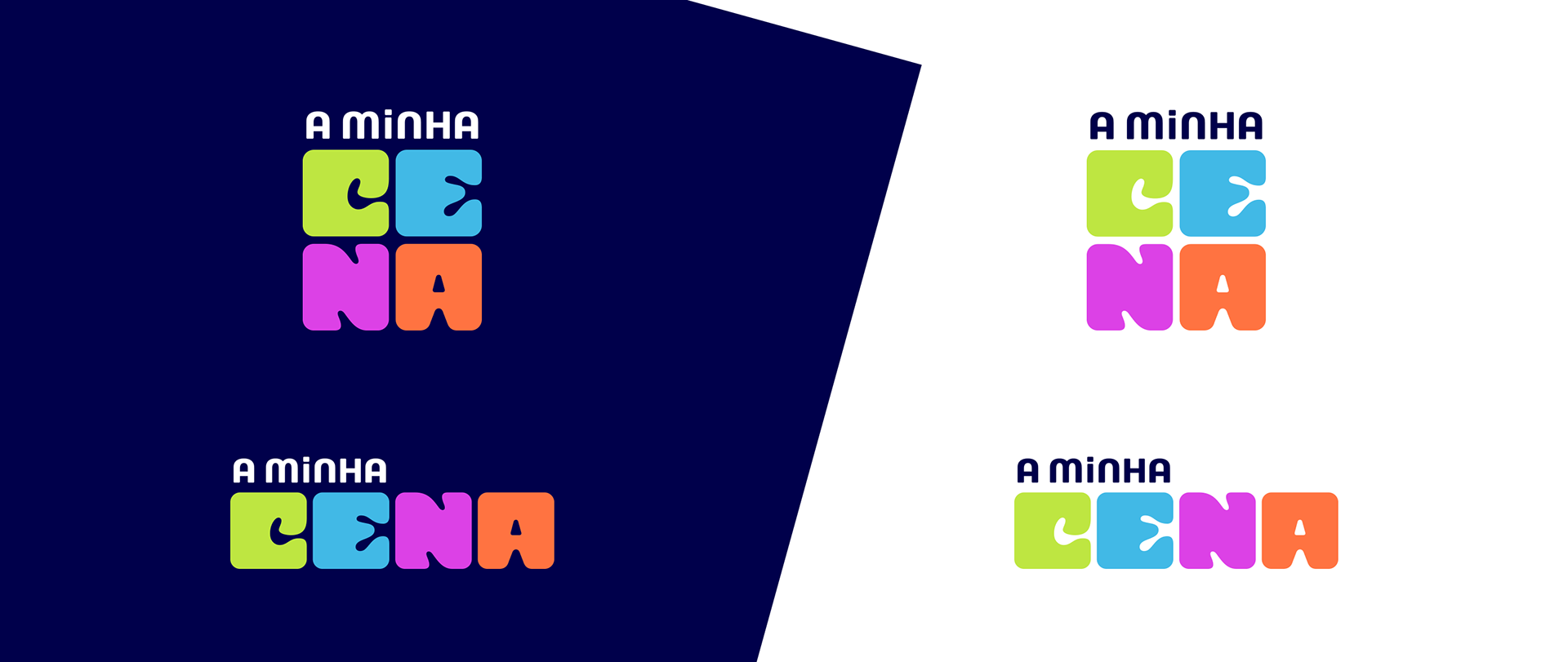
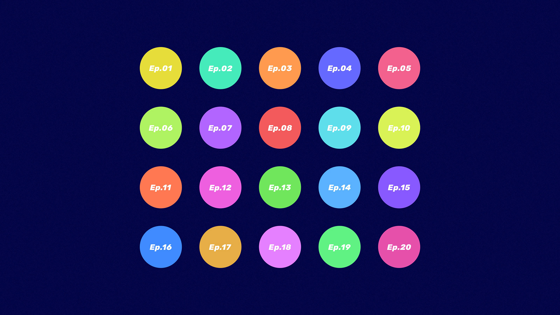
The Portuguese channel RTP2 has a segment dedicated to kids and preteens. And “A Minha Cena” was part of this same segment. A 20 episode documentary TV show where the younger audience is the star. Each episode focuses on a different child, and they show their day-to-day lives and talk about their favorite things. The aim is to show young viewers unique perspectives and realities that may be different from their own.
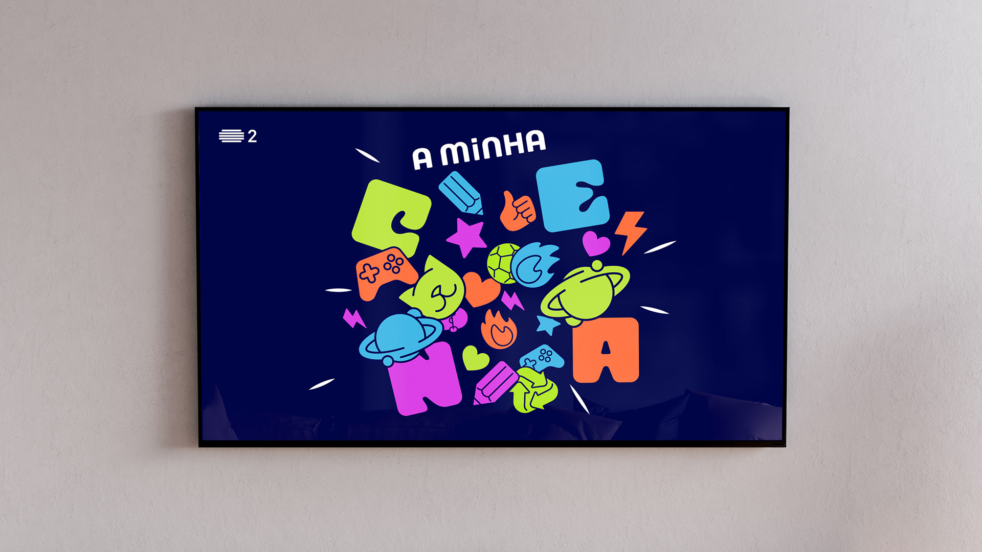
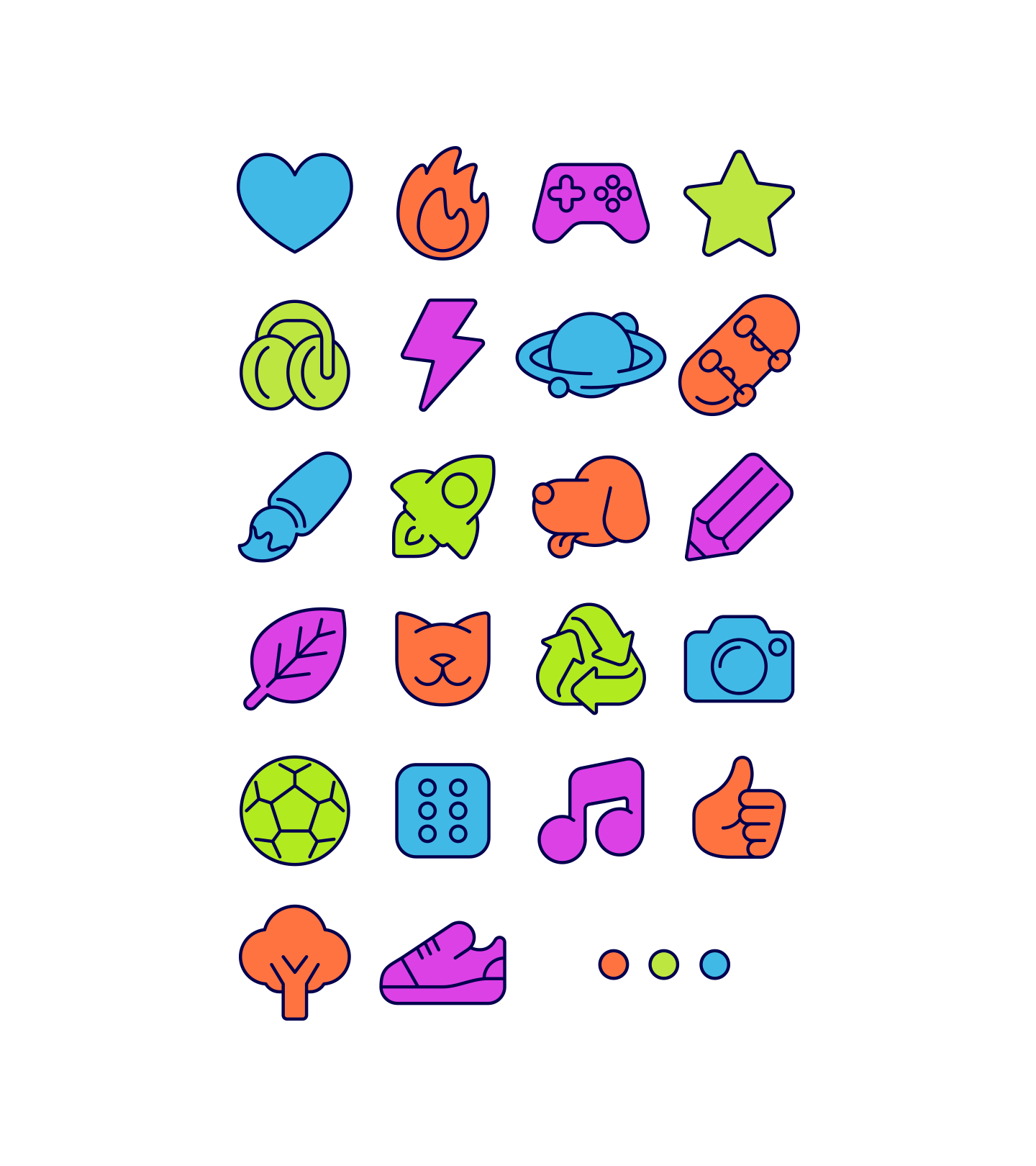
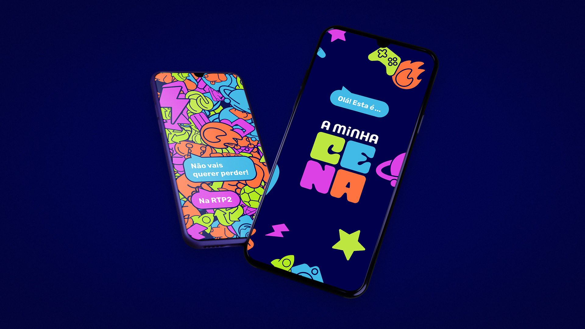
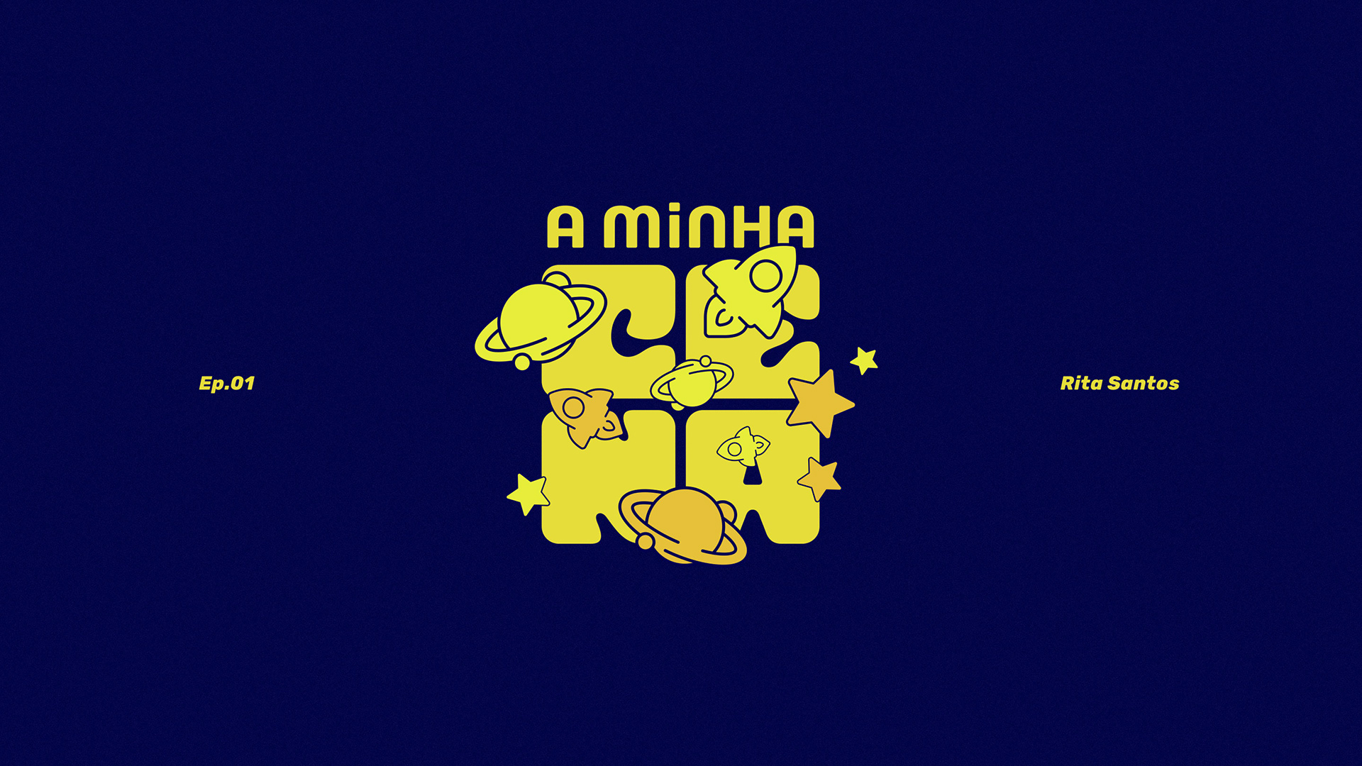
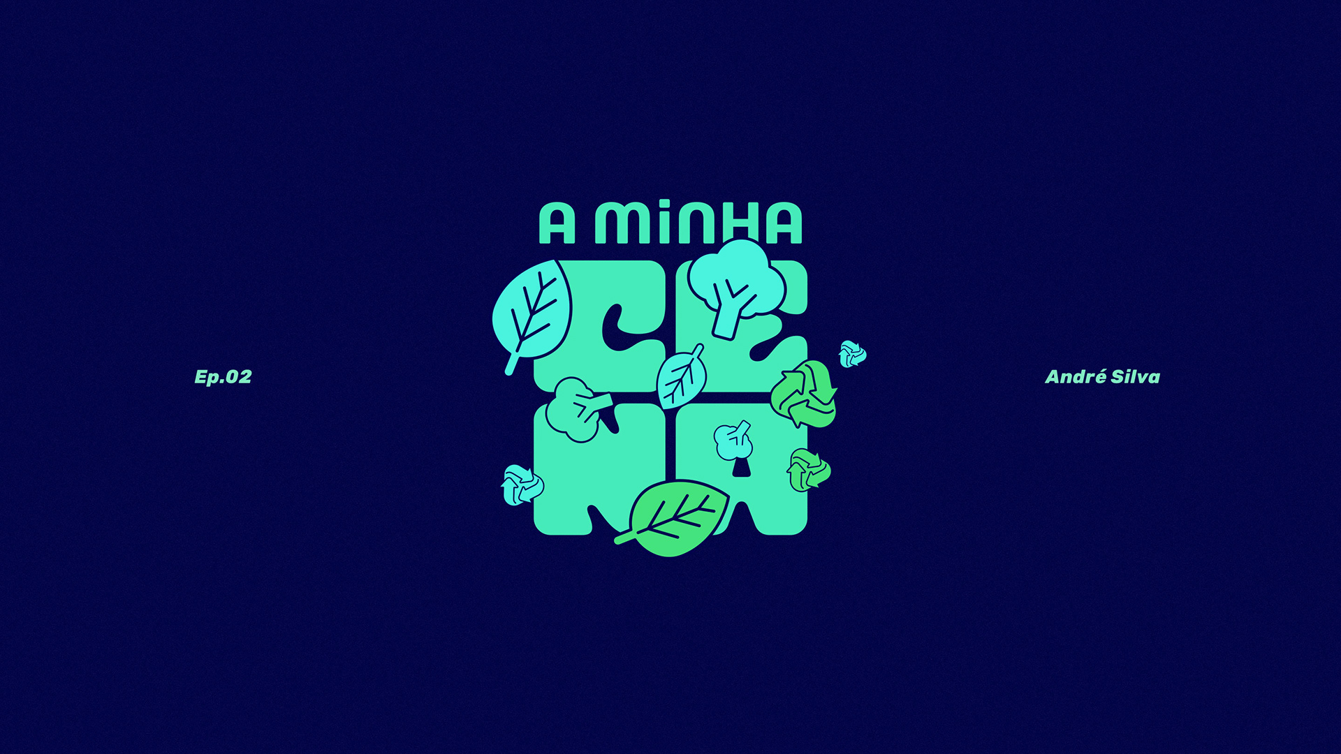
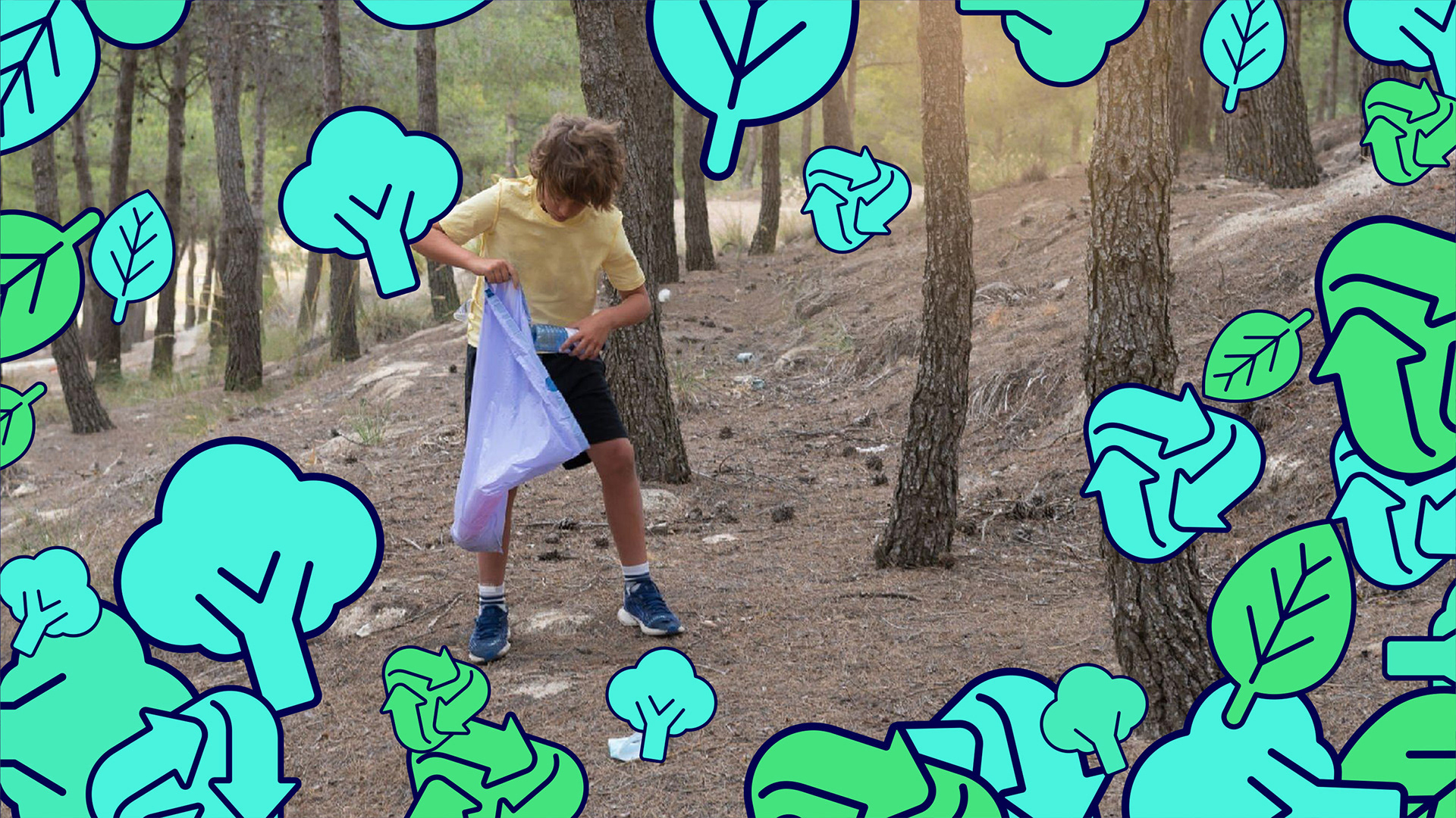
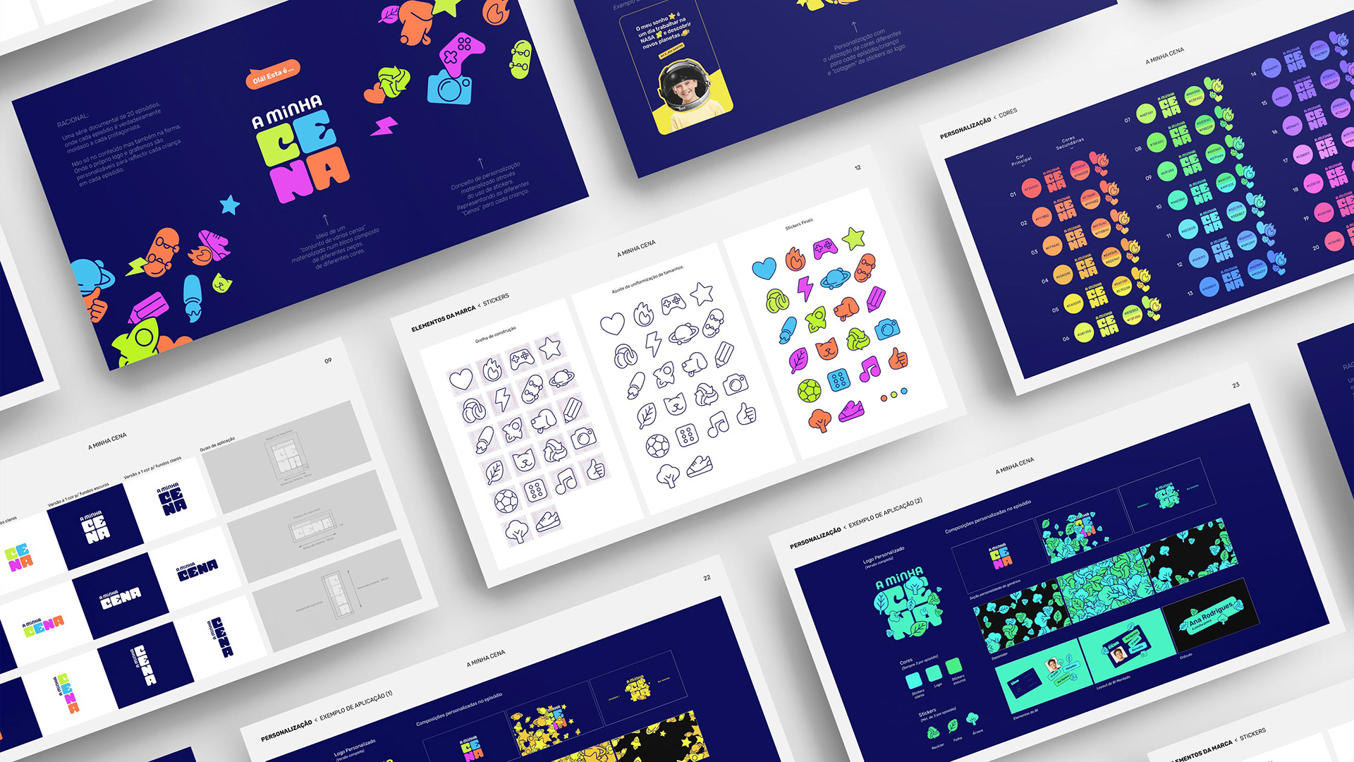
“A Minha Cena” means “My Thing” in Portuguese. And so, the visual identity was designed to reflect the many kids on the show and their own unique “things”. With a logo that aims to be a cluster of different personalities, and a collection of digital stickers that showcase each child's individual interests and favorites. Furthermore the visual language is elastic enough to go from all-out chaos to a more personalized visual in each episode. Focusing on the child in each episode.


CLIENT: RTP | PROJECT: A MINHA CENA | AGENCY: DOGMA CREATIVE
IDENTITY DESIGN & ART DIRECTION: DANIEL MACHADO
IDENTITY DESIGN & ART DIRECTION: DANIEL MACHADO