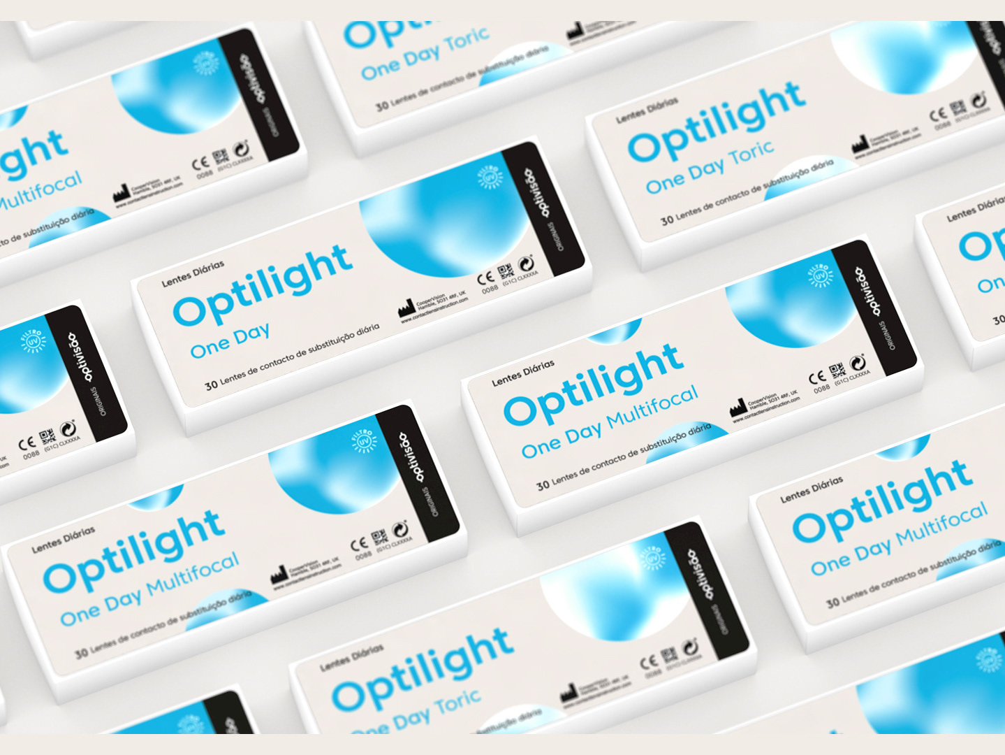
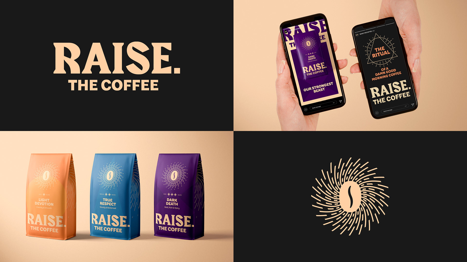
“Raise. The coffee” is an online exclusive whole bean coffee brand, meant only for true worshipers of good quality coffee. Morning ritual practitioners are obsessed with freshly ground coffee, and their personal and perfected coffee making techniques.
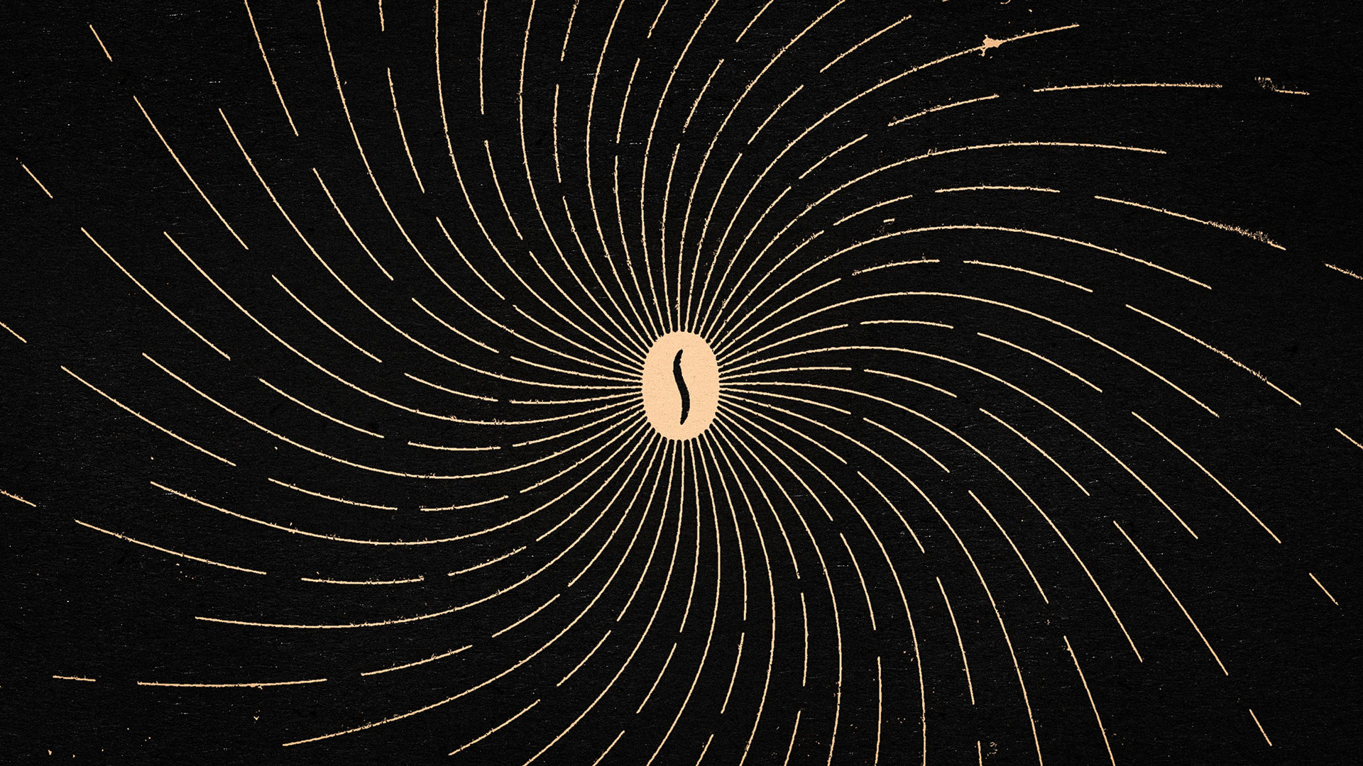
The logo, symbol and visual system were made as an homage to the classic fictional dark cults of Hollywood. From the coffee bean as a secret eye symbol emitting an ominous aura, to the odd rock craved style typography and the lore driven coffee names. This is the early identity work, and the brand was later further developed in a different direction, where only this name and symbol were kept.
CLIENT: RAISE. THE COFFEE | PROJECT: BRANDING | AGENCY: TORKE CC
BRAND DESIGN: DANIEL MACHADO | BRAND STRATEGY: NUNO BELMONTE
COPYWRITTING: ANDRÉ MUHLE | DIRECTION: HUGO TORNELO
BRAND DESIGN: DANIEL MACHADO | BRAND STRATEGY: NUNO BELMONTE
COPYWRITTING: ANDRÉ MUHLE | DIRECTION: HUGO TORNELO